Background
The question I set out to answer: where are DC's crashes actually concentrated, who is getting hurt, and what does a decade of Vision Zero data reveal about the city's progress — or lack of it?
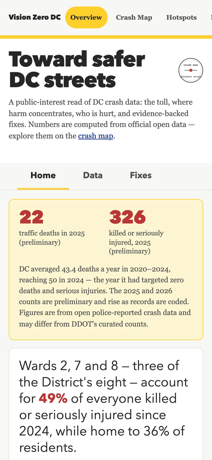
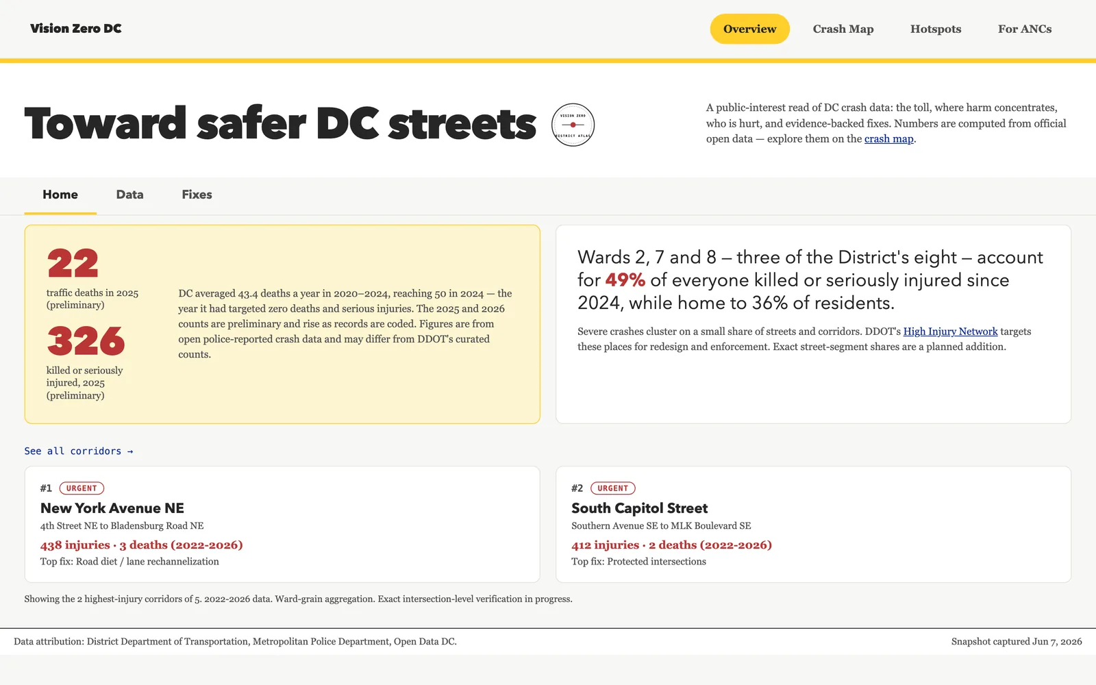
DC launched Vision Zero in 2015 with a stated goal of eliminating traffic deaths by 2024. The city missed that target. Fatalities and serious injuries continue, and the underlying data — geocoded police-reported collisions from DDOT and MPD — is technically public but buried in ArcGIS endpoints most people can't easily query. The accountability scorecard on this tool names the missed target plainly: how many people died, how many were killed or seriously injured, and how that compares to the city's own baseline. The crash map makes the spatial pattern legible — ward by ward, intersection by intersection — and the recommendations surface proven countermeasures with real crash-reduction figures so the data points somewhere, not just at the problem.
How It Works
Two pages, no build step, no backend server, no dependencies to install:
- Safety Overview (landing page): an accountability scorecard tracking deaths and KSI (killed or seriously injured) against DC's missed 2024 Vision Zero target; a deaths-vs.-serious-injuries trend by year; a mode-share breakdown showing who is being hurt (pedestrians, cyclists, vehicle occupants); a "where harm concentrates" band flagging which wards bear disproportionate crash risk relative to population; evidence-backed policy recommendations with confidence scores; a curated countermeasure library with cited crash-reduction figures from the engineering literature; and a directory of advocacy groups and government agencies working on DC street safety. The scorecard and trend data come from a baked snapshot —
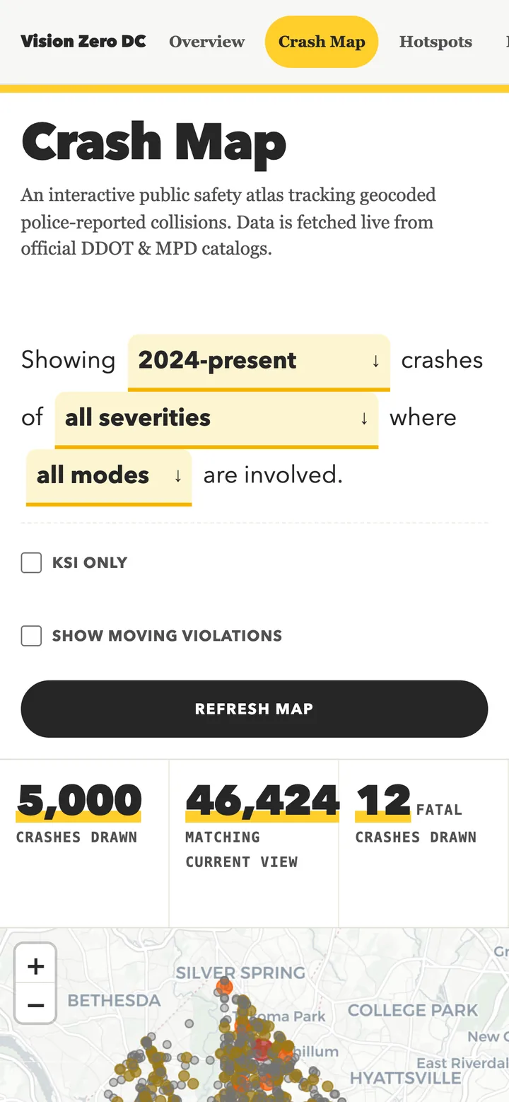
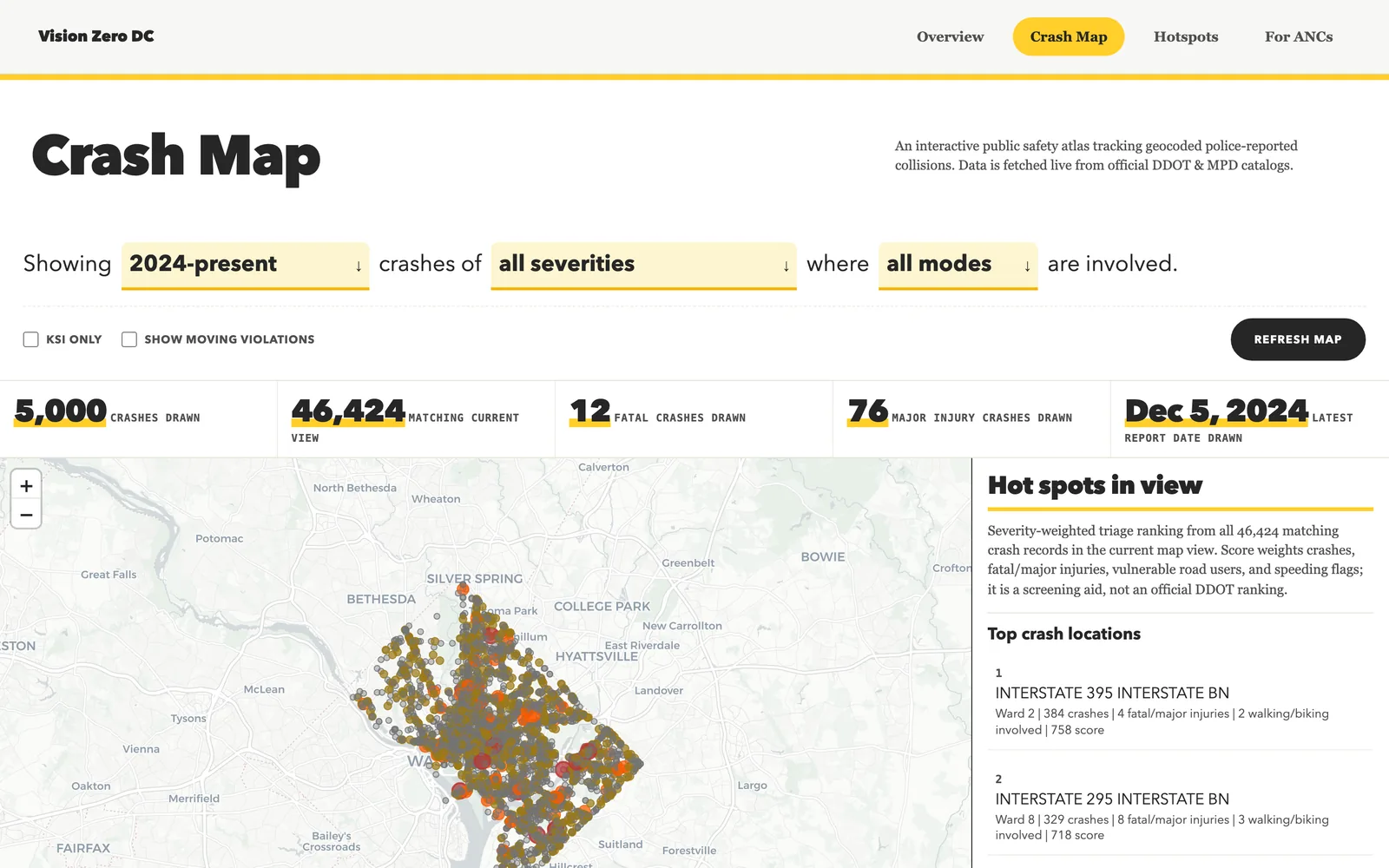
pipeline/snapshot.pyqueries the live ArcGIS endpoint and writes a staticdata/crash-summary.jsonwith per-ward totals, fatalities, KSI, and exposure rates. Re-runs are idempotent; raw caches are gitignored. - Crash Map: a live Leaflet map querying DC's official ArcGIS crash layer in real time. Filters: date window (2024-present through all records), severity (all, fatal, KSI, injury), mode (all, pedestrians, cyclists), and moving violations by month. Hot spots in the current view are ranked by crash concentration and by ward crash rates per square mile and per 100k residents. Selecting a crash opens a full incident case file with the collision record from the details layer. Every filter combination is mirrored into the URL query string so any view is bookmarkable and shareable. Recommendation cards on the landing page deep-link into the map with the relevant filters already applied.
- Tested throughout: Python tests guard the pipeline's area math, aggregation logic, and sanity gates. Node tests (no framework, no npm install) cover the frontend's pure crash-logic functions — severity scoring, triage weights, URL state round-trips, and the map reload-skip guard. Both suites run in GitHub Actions and gate deployment; a failing test blocks the deploy.
A Look Inside
Each view shown on mobile and desktop — tap any image to open the live site.